
Introduction
Thank you for choosing the Invena Tailwind CSS Edition. This is the modern, utility-first version of our Invena Business Consulting template, rebuilt entirely on top of Tailwind CSS v3.4.
Unlike the original HTML/Bootstrap version, the Tailwind edition gives you:
- Smaller CSS bundle — only the utilities you use are compiled.
- Design-token first — change colors and fonts in one config file.
- Inline styling — modify components directly in the HTML.
- Responsive by default — mobile-first breakpoints baked in.
This guide walks you through the project structure, the build pipeline, and how to customize every part of the template.
1.1. What's Included
After downloading the package from your Envato account, the bundle contains:

- invena-tailwind/ — the production-ready Tailwind template files.
- documentation/ — this guide.
- tailwind.config.js — the Tailwind theme/customization config.
- package.json — npm scripts for building and watching CSS.
1.2. Folder Structure
Here is what the Tailwind project layout looks like:
invena-tailwind/
├── assets/
│   ├── css/
│   │   ├── src/
│   │   │   └── tailwind.css         # Tailwind input file (@tailwind directives)
│   │   ├── vendor/
│   │   │   ├── tailwind.min.css     # Compiled output (DO NOT edit by hand)
│   │   │   ├── bootstrap.min.css
│   │   │   └── animate.css
│   │   ├── plugins/                 # 3rd-party plugin styles
│   │   └── style.css                # Custom project styles
│   ├── js/
│   │   ├── main.js
│   │   ├── plugins/                 # GSAP, Swiper, AOS, etc.
│   │   └── vendor/                  # Bootstrap, jQuery UI, etc.
│   ├── fonts/
│   └── images/
├── *.html                           # 24+ home variants and inner pages
├── tailwind.config.js               # Theme tokens (colors, fonts, container)
├── package.json                     # npm scripts
└── package-lock.json
1.3. Fonts
Invena Tailwind uses two Google fonts: Red Hat Display for headings and DM Sans for body text. They are loaded via Google Fonts in every
HTML file:
<link rel="preconnect" href="https://fonts.googleapis.com">
<link rel="preconnect" href="https://fonts.gstatic.com" crossorigin>
<link href="https://fonts.googleapis.com/css2?family=DM+Sans:ital,opsz,wght@0,9..40,100..1000;1,9..40,100..1000&family=Red+Hat+Display:ital,wght@0,300..900;1,300..900&display=swap" rel="stylesheet">
Use them in any markup with the helpers font-primary (Red Hat Display) and font-secondary (DM Sans), defined in tailwind.config.js.
Tailwind Setup
The template ships with a pre-built tailwind.min.css. You only need to run the build pipeline if you
change tailwind.config.js, edit the source CSS, or add new
utility classes that haven't been used yet anywhere in the HTML.
2.1. Requirements
- Node.js v16 or higher — download here.
- npm v8+ (bundled with Node.js).
- A code editor — VS Code recommended (with the Tailwind CSS IntelliSense extension).
2.2. Install Dependencies
Open a terminal in the invena-tailwind folder and install the dev dependencies:
# 1. Navigate to the project root
cd invena-tailwind

# 2. Install Tailwind CSS and its CLI
npm install
This will install tailwindcss@^3.4.0 as
defined in package.json.
2.3. Build Commands
Three npm scripts are defined in package.json:
| Command | Purpose |
|---|---|
npm run dev |
One-time, unminified build. Useful when debugging. |
npm run watch |
Watch HTML/JS and rebuild CSS on change. Use during development. |
npm run build |
Minified production build. Run before deployment. |
Underlying CLI:
tailwindcss -i ./assets/css/src/tailwind.css \
            -o ./assets/css/vendor/tailwind.min.css \
            --minify     # or --watch
2.4. tailwind.config.js
This is the heart of the customization. Every color, font, and breakpoint flows through it:
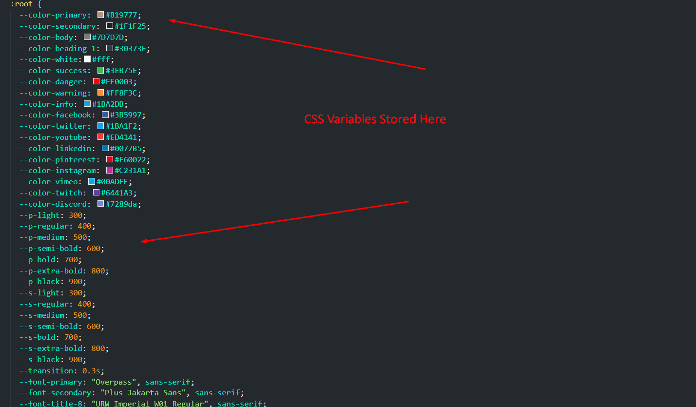
/** @type {import('tailwindcss').Config} */
module.exports = {
  content: [
    "./*.html",
    "./assets/js/**/*.js",
  ],
  theme: {
    container: {
      center: true,
      padding: '15px',
    },
    extend: {
      maxWidth: {
        'container': '1335px',
      },
      colors: {
        primary:   '#0b4df5',
        secondary: '#1F1F25',
        body:      '#5D666F',
        heading:   '#1C2539',
        sky:       '#82b440',
        dark:      '#1E1E20',
      },
      fontFamily: {
        primary:   ['"Red Hat Display"', 'serif'],
        secondary: ['"DM Sans"', 'serif'],
        bricolage: ['"Bricolage Grotesque"', 'sans-serif'],
      },
    },
  },
  plugins: [],
  corePlugins: {
    preflight: false,    // disabled — Bootstrap reset is used
    container: false,    // custom container utility used instead
  },
}
Heads up
Tailwind's preflight is disabled because the
template still uses Bootstrap's reset under the hood. Don't enable it unless you also
remove Bootstrap.
2.5. Source CSS Entry
The Tailwind input file lives at assets/css/src/tailwind.css:
/* Invena - Tailwind CSS Input */
@tailwind base;
@tailwind components;
@tailwind utilities;

/* Custom Invena utilities for common patterns */
@layer components {
  .header-container {
    @apply max-w-[1335px] mx-auto px-4 sm:px-6 lg:px-8;
  }

  .btn-group {
    @apply flex items-center gap-4;
  }
}
Add your own component classes inside @layer components using @apply to
compose Tailwind utilities into reusable classes.
Source Files
3.1. CSS Files (in <head>)
<link rel="stylesheet preload" href="assets/css/plugins/fontawesome.css" as="style">
<link rel="stylesheet preload" href="assets/css/plugins/swiper.css" as="style">
<link rel="stylesheet preload" href="assets/css/plugins/metismenu.css" as="style">
<link rel="stylesheet preload" href="assets/css/plugins/magnifying-popup.css" as="style">
<link rel="stylesheet preload" href="assets/css/plugins/odometer.css" as="style">
<link rel="stylesheet preload" href="assets/css/vendor/tailwind.min.css" as="style">
<link rel="stylesheet preload" href="assets/css/style.css" as="style">
Order matters: keep tailwind.min.css
before style.css so your custom rules can override
Tailwind utilities when needed.
3.2. JS Files (before </body>)
<script src="assets/js/plugins/jquery.js"></script>
<script src="assets/js/plugins/odometer.js"></script>
<script src="assets/js/plugins/jquery-appear.js"></script>
<script src="assets/js/plugins/gsap.js"></script>
<script src="assets/js/plugins/split-text.js"></script>
<script src="assets/js/plugins/scroll-trigger.js"></script>
<script src="assets/js/plugins/smooth-scroll.js"></script>
<script src="assets/js/plugins/metismenu.js"></script>
<script src="assets/js/plugins/magnific-popup.js"></script>
<script src="assets/js/plugins/swiper.js"></script>
<script src="assets/js/plugins/contact.form.js"></script>
<script src="assets/js/main.js"></script>
Basic Site Settings
4.1. Change Site Title and Favicon
Open any .html page in your editor.
Inside the <head>, update the <title> and the favicon <link>:
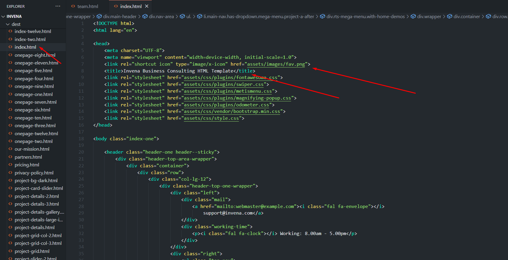
<link rel="shortcut icon" type="image/x-icon" href="assets/images/fav.png">
<title>Your Site Title</title>
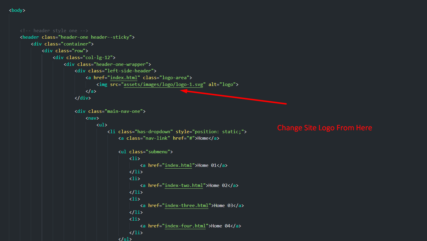
4.2. Change Logo
Replace the SVG/PNG inside assets/images/ and update the <img> reference in the header partial of each page.
4.3. Customize Menu
The main navigation lives in the header markup of each HTML
file. Edit the <ul class="nav"> structure to add, remove,
or rename menu items. Tailwind utility classes control spacing and color directly.

Customization
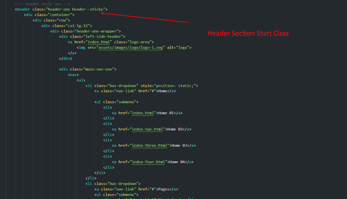
5.1. Header
Header markup is inline in every HTML page. Common Tailwind classes used:
header--sticky— sticky positioning helper fromstyle.css.max-w-[1335px] mx-auto px-4 sm:px-6 lg:px-8— fluid container.flex flex-wrap items-center justify-between— layout grid.
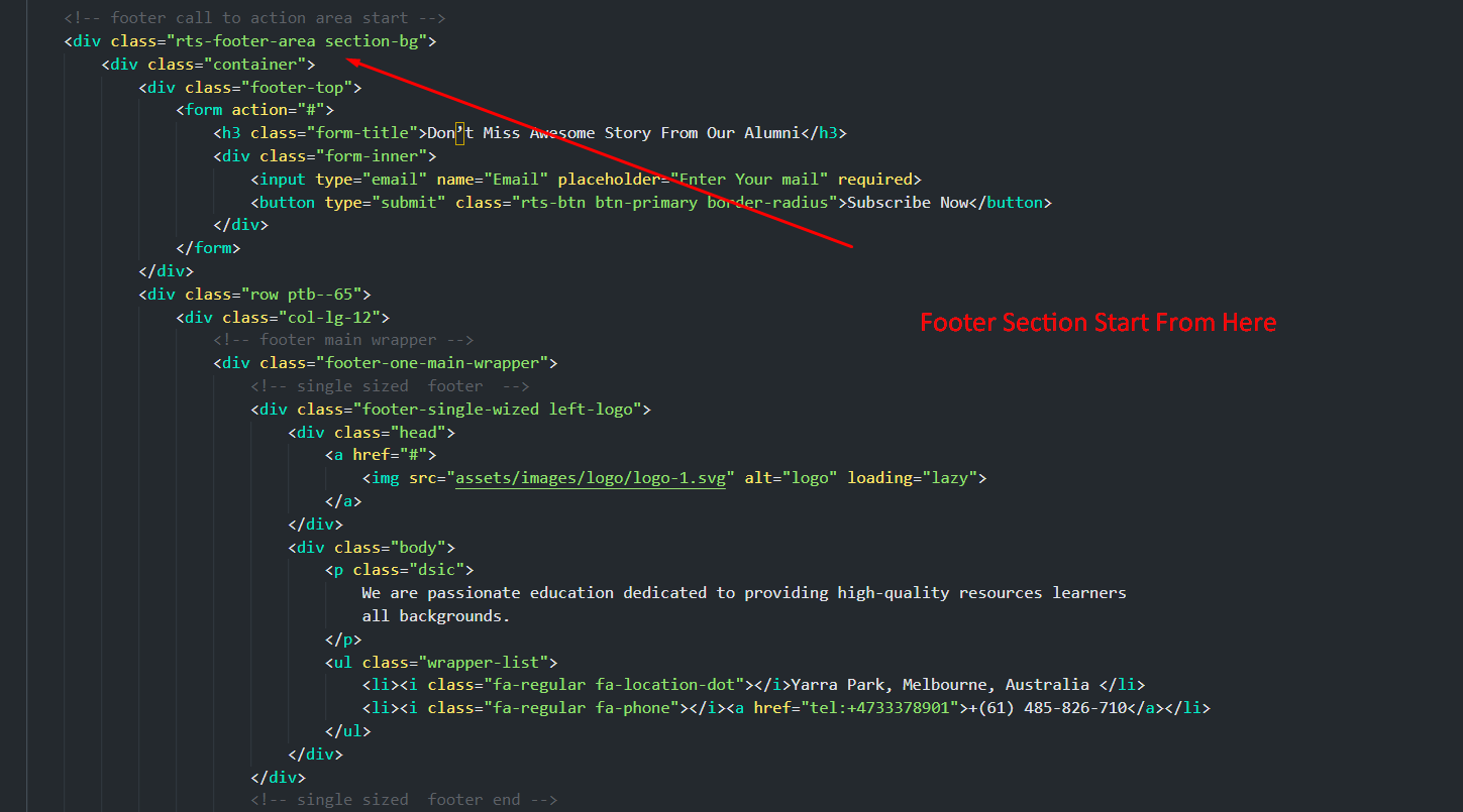
5.2. Footer
Footer markup is also inline. Adjust columns by changing the
Tailwind grid classes — e.g. grid grid-cols-1 md:grid-cols-2 lg:grid-cols-4 gap-8.
5.3. Global Colors
Open tailwind.config.js and edit the
colors tokens. Then run npm run build to regenerate the CSS:
colors: {
  primary:   '#0b4df5',   // brand color → bg-primary, text-primary, border-primary…
  secondary: '#1F1F25',
  body:      '#5D666F',   // default body text
  heading:   '#1C2539',   // headlines
  sky:       '#82b440',   // accent green
  dark:      '#1E1E20',
},
Every utility built from the token name (bg-primary, text-primary/80, border-primary, etc.) updates automatically.
5.4. Typography
Replace the family in tailwind.config.js, swap the Google Fonts <link> in the <head>, then
rebuild:
fontFamily: {
  primary:   ['"Your Heading Font"', 'serif'],
  secondary: ['"Your Body Font"', 'sans-serif'],
},
Use them with font-primary and font-secondary in your markup.
5.5. Custom Utility Classes
Reusable patterns are declared in assets/css/src/tailwind.css using @apply:
@layer components {
  .header-container {
    @apply max-w-[1335px] mx-auto px-4 sm:px-6 lg:px-8;
  }

  .btn-group {
    @apply flex items-center gap-4;
  }

  /* Add your own component classes here */
  .btn-primary {
    @apply inline-flex items-center justify-center rounded-md bg-primary px-6 py-3
           font-semibold text-white transition hover:bg-primary/90;
  }
}
Run npm run watch while editing so
changes appear immediately.
5.6. Page Content
Each page is a self-contained HTML file. Find the section you want to edit, change the text or images, and (optionally) tweak the surrounding Tailwind utilities to adjust spacing/typography.

5.7. Contact Form
Update the recipient email in mailer.php and on the form's action
attribute:
<form action="mailer.php" method="post" class="space-y-4">
  ...
</form>

Migrating from the HTML Edition
If you previously used the Bootstrap/HTML edition of Invena, here is how the equivalent classes map to Tailwind:
| Bootstrap (HTML edition) | Tailwind (this edition) |
|---|---|
container |
max-w-[1335px] mx-auto px-4 sm:px-6 lg:px-8 |
row |
flex flex-wrap -mx-3 or grid grid-cols-12 gap-6 |
col-md-6 |
w-full md:w-1/2 px-3 or md:col-span-6 |
d-flex justify-content-between
|
flex justify-between |
btn btn-primary |
bg-primary text-white px-6 py-3 rounded-md hover:bg-primary/90
|
text-center |
text-center (same) |
mt-4 |
mt-4 (same) |
Support
Support Scope
Included in Free Support:
- Fixing bugs in the template files.
- Helping clients change site contents that are not covered by this documentation.
- Answering Tailwind config / build questions related to the template.
NOT Included in Free Support:
- Custom code changes or new sections.
- Updating client site content on their behalf.
- Generic Tailwind / npm support unrelated to the template.
Paid Support:
For custom changes we offer paid support, which includes:
- Custom change requests
- Custom pages / sections
- Custom features and integrations
Flat rate: $25 / hour.
Open a Ticket
Submit your support request here. We respond within 1 business day.
Regards,
Reactheme Support Team